Construction of the Ritz Cinema, Edinburgh,
1929 (UK, 1929))
I'd previously seen this in a somewhat
abridged version. This version is pretty
unabridged! The impending manager shot
it over six months. Why so long? They're converting to sound! You can gloss over the fact in film history class, but this actual document reveals how much of a risk and an investment that change really represented.
Unlike the much better known government sponsored/Empire Marketing Board films coming out of the UK at the same time, this piece is plainly promotional, and plainly commercial. (Obviously in their own ideological way the EMB films also promote plenty.) That sort of suggests the dubious direction that so much future sort-of-documentary, making-of filmmaking would take. The promotional problem here, though, is that the film is much too long for a commercial, and much too committed and affectionate to be merely in the service of mammon.
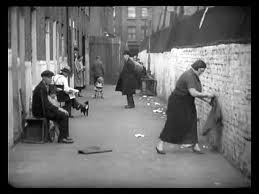
And to what is this commitment and affection directed? Certainly not the film industry's sometimes superficiality, or its profiteering impulses. Instead of the product or its producers we get matter-of-fact images of local labour, which adds up to being a tribute to the local labourer. Not incidentally, this is also the intent and reputation of all of those EMB films. Regardless of intent or method, sponsored/ professional or not, honest docs tend to come back to the same big, true things.
It's significant that there’s no heroic herring pulling here, unlike John Grierson's inaugural EMB production, the contemporaneous worker-loving Drifters. Instead of dramatic camera angles and the bounding main we get plain people, actually working (or wiping bird poop off their necks, or amusingly going back down
the ladder when the noon whistle blows).
The cinema goes up in stages, which are all labeled. There’s naturally some selection, and a great
deal of compression, but there’s also wonderful detail, making the film not a
fetishization, nor an idealization, but a true record. At the end we get a parade of usher girls:
Violet, Daisy, Pansy, Iris, Rose, Lily, one allegedly named Heliotrope, Dorothy and finally the bemused boy carrying the candy tray. Each young person is brimming with delightful teenage individuality, and each one is lovely.
Click, see:
http://ssa.nls.uk/film.cfm?fid=0774
Unlike the much better known government sponsored/Empire Marketing Board films coming out of the UK at the same time, this piece is plainly promotional, and plainly commercial. (Obviously in their own ideological way the EMB films also promote plenty.) That sort of suggests the dubious direction that so much future sort-of-documentary, making-of filmmaking would take. The promotional problem here, though, is that the film is much too long for a commercial, and much too committed and affectionate to be merely in the service of mammon.
 |
| Edinburgh from the air; image found by Drew D. |
And to what is this commitment and affection directed? Certainly not the film industry's sometimes superficiality, or its profiteering impulses. Instead of the product or its producers we get matter-of-fact images of local labour, which adds up to being a tribute to the local labourer. Not incidentally, this is also the intent and reputation of all of those EMB films. Regardless of intent or method, sponsored/ professional or not, honest docs tend to come back to the same big, true things.
 |
| J.G., Drifters (1929) |
Click, see:
http://ssa.nls.uk/film.cfm?fid=0774
Housing Problems (UK, British Commercial Gas Association, 1935)
This pioneering piece was one of the very first documentaries to capture its subjects by conducting interviews and recording actual location sound. It is both
technologically and stylistically awkward. As is so often the case, the latter is largely caused by the
former. This kind of thing can give us pause, or even engender resistance. But we shouldn't pause too long, or resist at all. It’s a blessing to think about
and enjoy beauty and form and everything. There
are times, though, when such concerns are not only superfluous, they’re in poor
taste.

The subject of this initially awkward, eventually devastating document is how bad mid-30's housing conditions in the UK are, as well as some of the consequences that follow. Design shortcomings (“Everything in the house is on the crook") lead us to the hygenical, and the heartrending. “Coming into these rooms I’ve had not luck since I’ve been in ‘em. First I lost one youngster in one. Then I lost another youngster seven weeks old ." (Also, the episode of Mrs. Graves and the rat!) This is very moving stuff, and extremely important as well. If they've told you and convinced you that the poor are always idle and they get what they deserve, then watch this and think it out again.
In typical 1930’s British doc fashion Housing Problems presents the difficulty, then pretty confidently proposes a solution. Given sponsorship, this structure was understandable, even necessary. Given the intractability of social ills, this structure may make us skeptical, and maybe leaves a lot to be desired. In this case, though, one suspects that the Oil concerns who paid for the film were in the right, in the end. Making a bit of money while helping people. It sounds pretty straightforward, pretty honourable, and in what they show and even suggest, pretty incontrovertible.
http://vimeo.com/4950031
The subject of this initially awkward, eventually devastating document is how bad mid-30's housing conditions in the UK are, as well as some of the consequences that follow. Design shortcomings (“Everything in the house is on the crook") lead us to the hygenical, and the heartrending. “Coming into these rooms I’ve had not luck since I’ve been in ‘em. First I lost one youngster in one. Then I lost another youngster seven weeks old ." (Also, the episode of Mrs. Graves and the rat!) This is very moving stuff, and extremely important as well. If they've told you and convinced you that the poor are always idle and they get what they deserve, then watch this and think it out again.
 |
| "Huis Clos" |
In typical 1930’s British doc fashion Housing Problems presents the difficulty, then pretty confidently proposes a solution. Given sponsorship, this structure was understandable, even necessary. Given the intractability of social ills, this structure may make us skeptical, and maybe leaves a lot to be desired. In this case, though, one suspects that the Oil concerns who paid for the film were in the right, in the end. Making a bit of money while helping people. It sounds pretty straightforward, pretty honourable, and in what they show and even suggest, pretty incontrovertible.
http://vimeo.com/4950031
Here come five films by New Zealander/General Post Office filmmaker Len Lye:
Kaleidoscope (UK, Imperial Tobacco Company of India, etc., 1935)
Kaleidoscope (UK, Imperial Tobacco Company of India, etc., 1935)
The greatest
cigarette commercial ever made! This is what would later become Norman McLaren’s complete cinematic paint box (http://www.nfb.ca/explore-all-directors/norman-mclaren), enacted with just as much joy and
virtuosity. A difference—not better, not
worse, just a difference—is that McLaren tended to concentrate on one or two
things at a time. Here he’d paint on the celluloid's surface and
make explicit the film’s path through the gate, there he’d cause his doodles to
switch from abstraction to characterization.
Len Lye is doing all this stuff at once, or at least one thing after another, in the same film. The colours, the moving background and the suggestions of collage are especially nice. This is also a happy demonstration about how music and picture work together. All by itself Don Baretto’s Cuban Orchestra might sound a little generic, and by themselves Lye's modernist/painterly images might be a little elusive or exhausting. Together they do a lovely job of mutual anchoring. A joyful movie.
http://www.youtube.com/watch?v=EF_ehWEL0Wc
A Colour Box (UK, GPO, 1935)
 |
| Lye, later. |
Len Lye is doing all this stuff at once, or at least one thing after another, in the same film. The colours, the moving background and the suggestions of collage are especially nice. This is also a happy demonstration about how music and picture work together. All by itself Don Baretto’s Cuban Orchestra might sound a little generic, and by themselves Lye's modernist/painterly images might be a little elusive or exhausting. Together they do a lovely job of mutual anchoring. A joyful movie.
http://www.youtube.com/watch?v=EF_ehWEL0Wc
A Colour Box (UK, GPO, 1935)
In picking this
up on behalf of the UK government's filmmaking General Post Office (GPO), and later clearing the way for McLaren at the Canadian government's filmmaking National Film Board of Canada (NFB), documentary dominie John Grierson reveals himself to be a
frivolous softy at heart. Thank heaven! Again, those
maracas are so delightful, and the toe-tapping Cuban sounds seem a perfect
complement for the running-over movement and colour of the film. I love the GPO/post office stuff; it plays like the
Ranimax pills in M. Lange’s (Renoir, 1935) charmingly ridiculous Western
stories. It's propaganda, so blatant and innocuous as to be guileless,
and unresentable.
http://www.screenonline.org.uk/film/id/442234/index.html
Rainbow Dance (UK, GPO, 1936)
http://www.screenonline.org.uk/film/id/442234/index.html
Rainbow Dance (UK, GPO, 1936)

http://www.youtube.com/watch?v=i_9kk59t-tU
Trade Tattoo (UK, GPO, 1937)
This is a real
extension, and a real deepening. For the
first time Lye incorporates documentary footage, and he does so to great
effect. We see workers working, in
support of commerce and trade and the general welfare. (Is this necessarily the case? Are their complexities, hypocrisies,
injustices? The fact that there are, and
that this is still valid and valuable, gets us very nicely to the paradox of
the subsidized documentary. There’s
serious compromise at the core, but it gradually enacts things that the secular
prophet crying in the wilderness never could.
We need activism and even fire breathing, but diplomacy will probably, ultimately
get you further.)

Lye continues to work his colour and kinetical magic, continues to use his various tints and stencils and washes. Music too, of course—the combination makes the whole thing seem positively joyful. The GPO is referenced throughout, becoming structurally integral, instead of just a comical afterthought. (The graphic/ typographical design is superb.) This isn’t Grierson fronting for one of his aesthetical pals, and this isn’t an aesthetical pal being sacrificed at the altar of mammon. It’s the creative treatment of actuality; the artist is uninhibitedly creative within the bounds established by the sponsor, and by his responsibilities to the public. This is a perfectly integrated artwork, formally and conceptually. “The rhythm of trade is maintained by the mails.”
http://www.youtube.com/watch?v=y28_6o2-ntc
Colour Flight (UK, 1938)
http://www.youtube.com/watch?v=RP4A8gQRtBo
Lye continues to work his colour and kinetical magic, continues to use his various tints and stencils and washes. Music too, of course—the combination makes the whole thing seem positively joyful. The GPO is referenced throughout, becoming structurally integral, instead of just a comical afterthought. (The graphic/ typographical design is superb.) This isn’t Grierson fronting for one of his aesthetical pals, and this isn’t an aesthetical pal being sacrificed at the altar of mammon. It’s the creative treatment of actuality; the artist is uninhibitedly creative within the bounds established by the sponsor, and by his responsibilities to the public. This is a perfectly integrated artwork, formally and conceptually. “The rhythm of trade is maintained by the mails.”
http://www.youtube.com/watch?v=y28_6o2-ntc
Colour Flight (UK, 1938)
This time it’s a commercial, plain and simple (sponsorship by Imperial Airways.) Countering that is another, kind of implausible plain-and-simple, that's almost like the lamb and the lion lying down together. At one point in this commercial film there’s a very brief spike into the objective,
as Lye's usual array of dancing shapes turns for an instant into an
airplane. Other than that we’ve got pure
abstraction. The most notable thing is
how successfully the objects are synchronized with the music. Like Oscar Fischinger’s contemporaneous An Optical
Poem, this is pure mickey mousing, a perfect blending of music and
movement. All the satisfactions of the
dance, and no ardent young lovers to put up with.
http://www.youtube.com/watch?v=RP4A8gQRtBo